 jilli design
Freelance Project
project introduction
For this project, I was taking an Arts Entrepreneurship class and was tasked with creating a final project geared towards my professional development. For me, that project was to find a freelance project to then add to this portfolio. This would help my professional development by allowing me to use my design skills outside the classroom and work with an actual client. To start the project, I needed to find freelance work. I had a friend reach out to me about a rebrand project they were working on with a group for a client in their Entrepreneurship capstone. The client was Chris Crader, who was looking to rebrand his product, Bar Brilliance. The product is a green, eco-friendly, and safe cleaner originally made for bar and restaurant owners to use on multiple surfaces, including glassware. The problem, however, was that the product launched right after the COVID-19 pandemic and lost many lined-up product deals. Although Bar Brilliance had been successful, Chris wanted to use this rebrand to show that the product could also be used in homes and reach a new audience that had once been overlooked.
ideation and process work
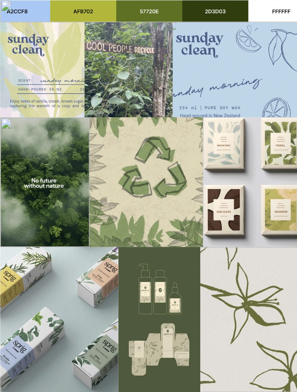
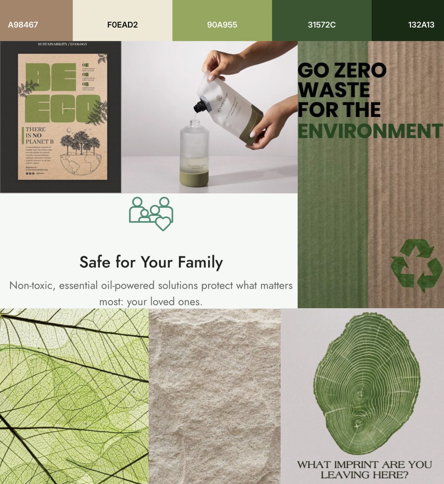
Keeping that homey, welcoming, and natural feeling, I created two style boards to show two potential directions the rebrand could take. They both use the same natural and inviting tone, but use different colors and styles to show it. The first one on the left uses bright and vibrant colors like lime green and blue. The style would consist of watercolor and sketched textures. The second direction on the right uses more muted tones of green and brown. This style would consist of natural and earthy textures. During the initial meeting for the project, I presented my style boards and also ideated some new name ideas with the rest of the group.
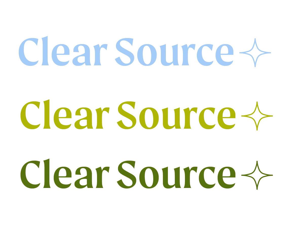
After a meeting to decide on a design direction, I began to ideate and sketch out a logo in Adobe Illustrator. In this first draft of the design, the name we landed on was Clear Source, and the design direction we went with was the first on the left with the vibrant greens and blue. For the logo, I wanted to keep it simple and type-heavy. I decided to incorporate a small star to represent the shine and clean finish the product leaves on surfaces. I used multiple of the colors from the palette to show the flexibility the logo could have.

After another meeting, Chris wasn’t completely settled on the name and look of Clear Source. We ended up pivoting and coming up with another name that was more vague and calming. After some ideating, we landed on the name Ever Clean and decided to use the second style board as the direction instead. The idea with this new name and direction was to take inspiration from the long-lasting evergreen trees. I was happy with this pivot because I actually had a better understanding and vision for the design and final product. The images below show my process and iterations of this new direction. I also shared a sketch I drafted for my packaging idea, now that the name and design direction were finalized at this point.

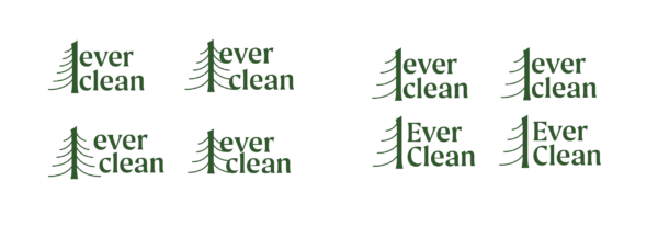
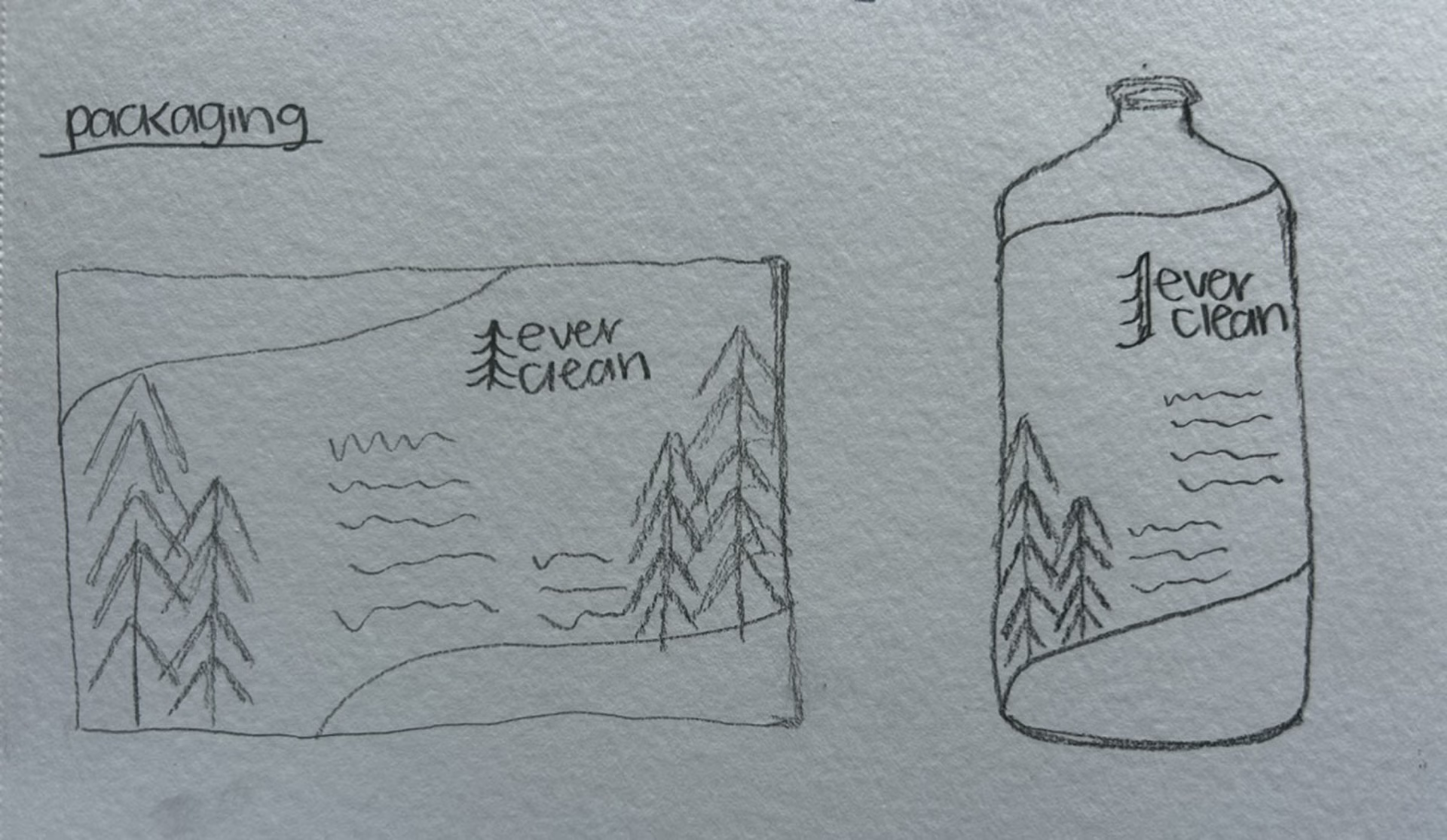
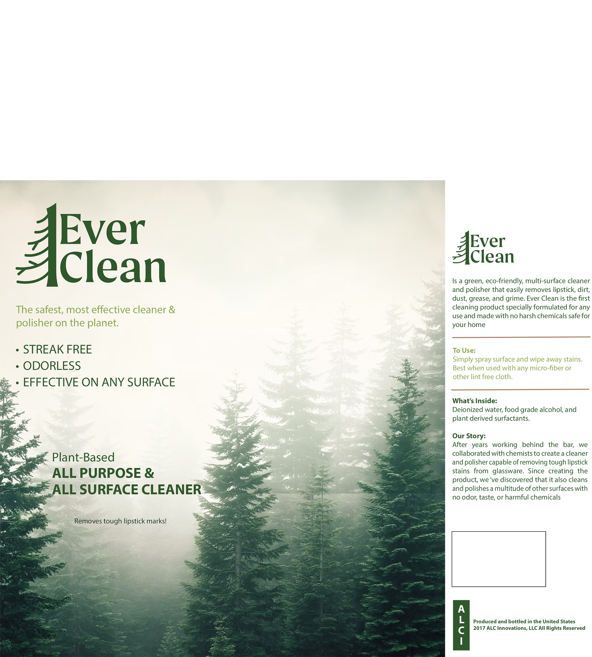
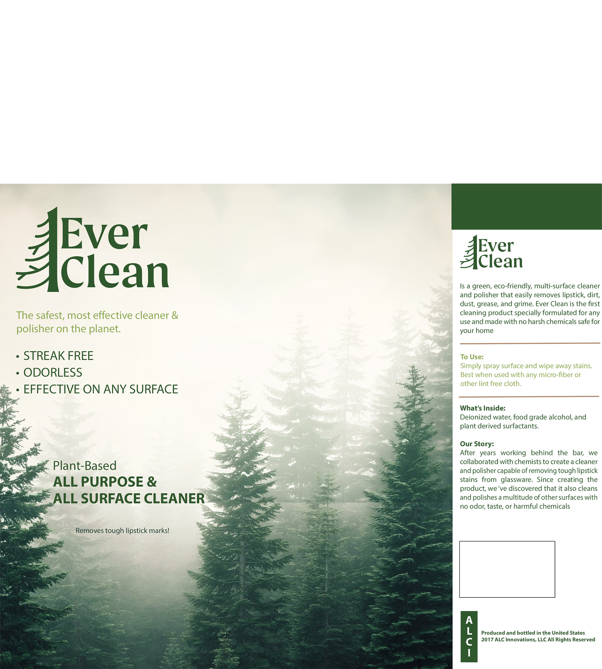
After a final meeting before the project deadline, I got feedback from the group and Chris to move forward with the capitalized version of the logo, the dark green, and the one-sided version of the tree. I also got feedback to create more and thicker branches and to make it look more “tree-like” with varying branches rather than perfectly organized. I also got the “OK” to move forward with the packaging design, which I created in Photoshop. I created and sent multiple versions of the packaging to the group for feedback.
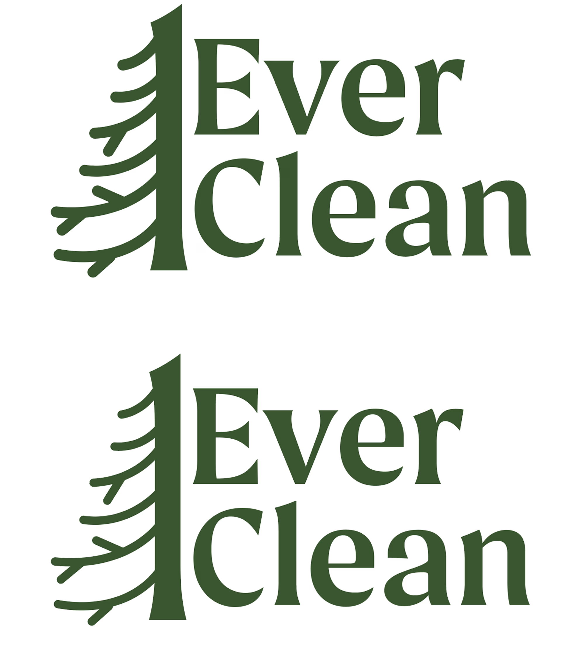
final product
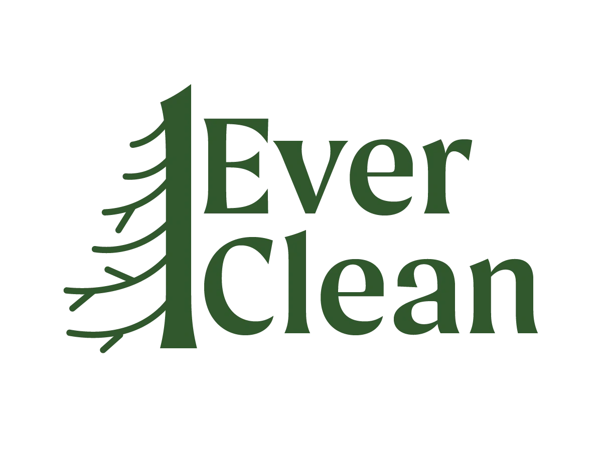
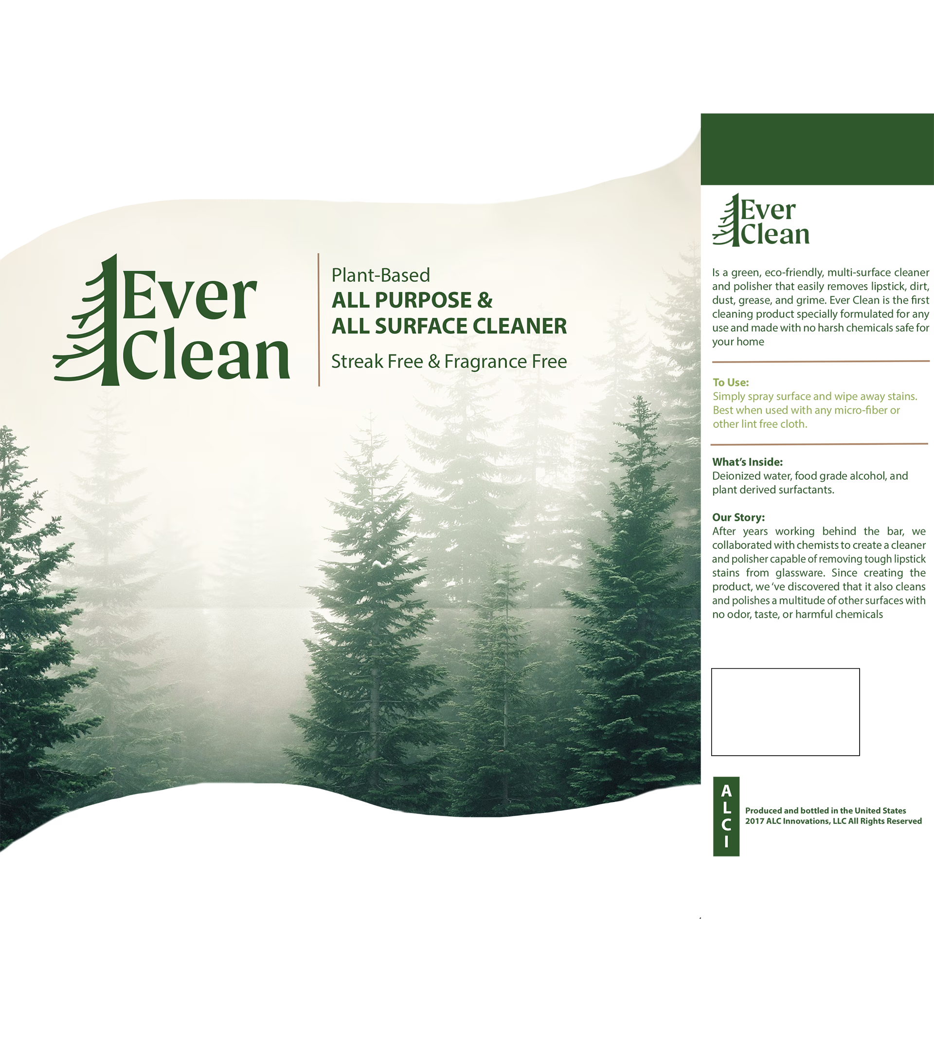
For the final designs, it was decided to go with the version of the logo that had slightly thinner strokes for the branches. For the final version of the packaging design, I removed some of the bulk of text on the front and created the wave element that was part of my original sketch. These final designs are something I am proud of and had a lot of fun completing.
reflections and learnings
Throughout this process, I learned how to work and communicate with a client and group that isn’t all that familiar with design. Chris gave the group and I a lot of creative freedom with this project, which I am thankful for. I also gained a sense of independence throughout this project as I was the sole source of design skill and knowledge. I also completed the project with very minimal guidelines, unlike projects I have completed in classes. This project paved a path for future freelance work and is something I am proud to showcase.