 jilli design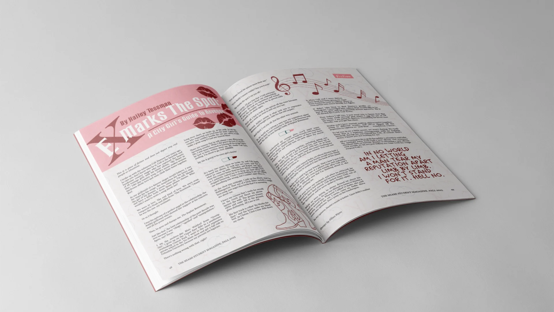
The Miami Student Magazine Story Design Volume XVII
project introduction
For this project, I was able to choose from a handful of budget lines or story proposals that I felt I wanted to design for. One story that interested me was about a young woman, Sophie, who is an unreliable narrator. She presents her ex-boyfriend as the problem, but really, she is everything he accused her of: a liar, toxic, a control freak, and immature. Her ex, Colt Dawson, a country artist, recently released a new album featuring a song about their relationship. Sophie thought this would be a song about how he missed her, but instead, it portrays her as the villain of the relationship. To salvage her reputation, Sophie needs to come up with an elaborate plot for revenge.
I chose this story to design for because I thought it would be a fun way to explore creative and visual storytelling. To create graphics that brought parts of the story to life and that enhanced the experience for readers. To start my process, I reached out to the writer and asked her what she had envisioned for it. I asked what colors, elements, and inspirations she had in mind. Her response gave me a basic understanding of the story and a vision for where to begin. This led me to create my mood/style board.
ideation and process work
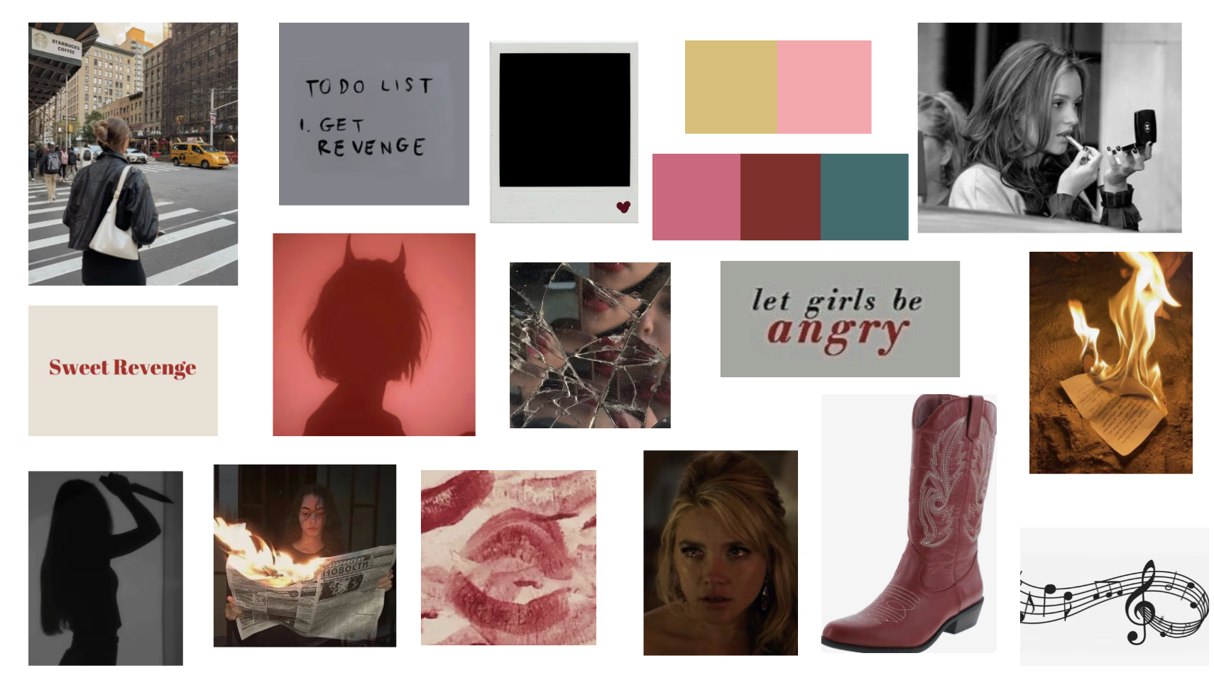
After creating a mood/style board, my next step was to begin drafting my design for the story. As the other designers and I began our drafting process, the writers were also drafting and editing the stories. When I began my draft for the design, the writer for the story already had a full first draft for me to read and draw inspiration from. After reading the story, I had a vision for what the story could look like. I used some elements from the mood board I created and began to pull images and create graphics. For my first draft, I wanted to tell the story through the images and graphics. After submitting my first draft, I quickly realized that I needed to choose between images and graphics to create a cohesive design and a smaller color palette. I also noticed I needed to be more subtle with my design and complement the story instead of trying to visualize it.
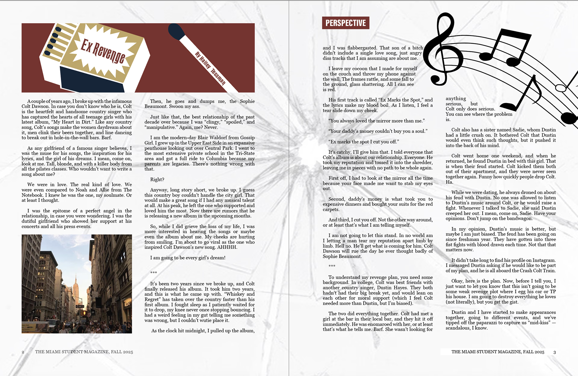
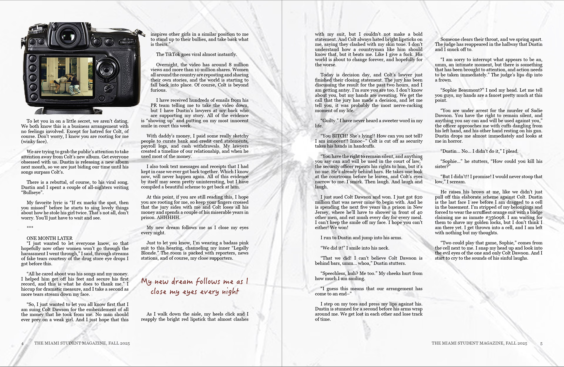
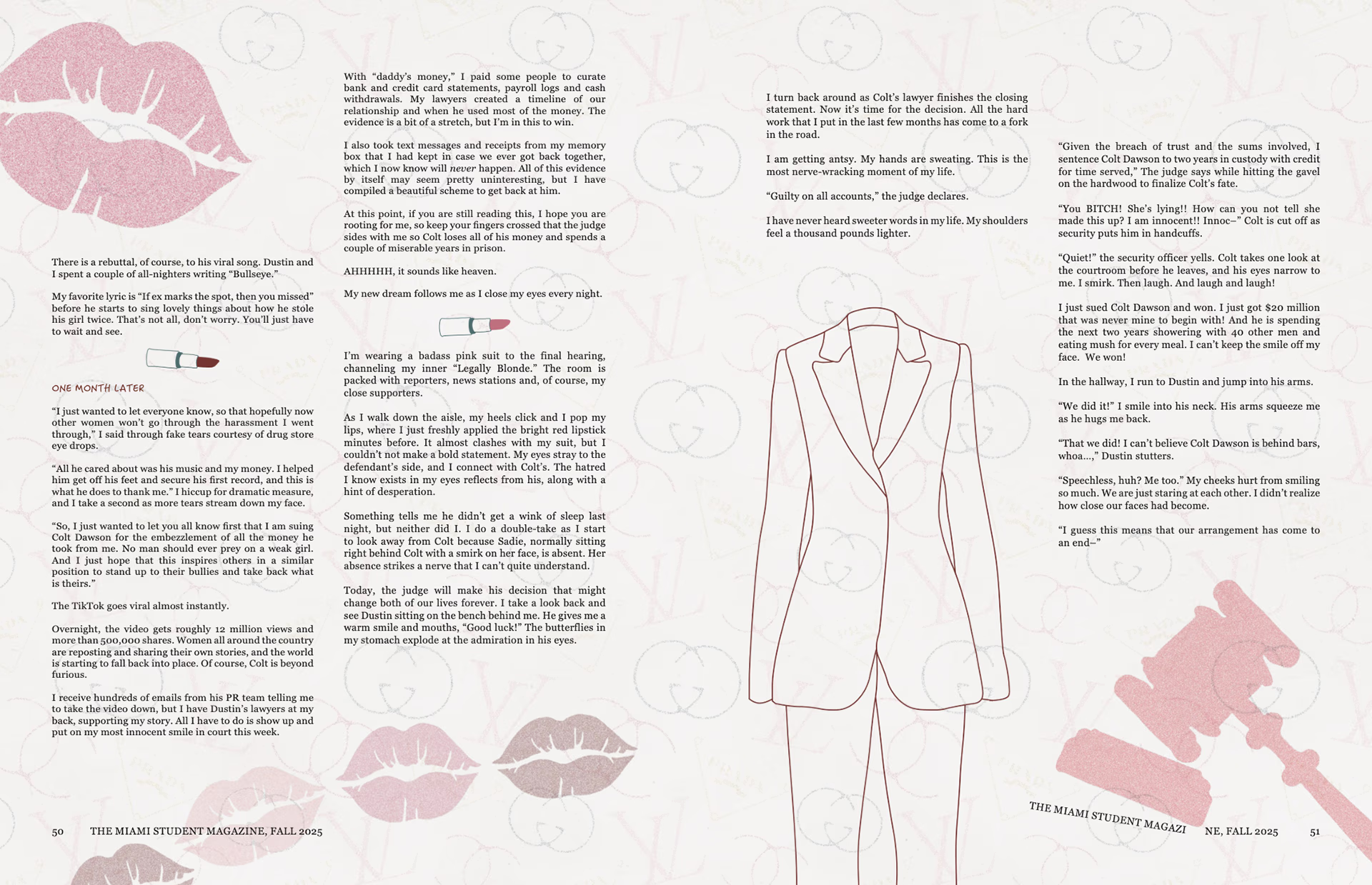
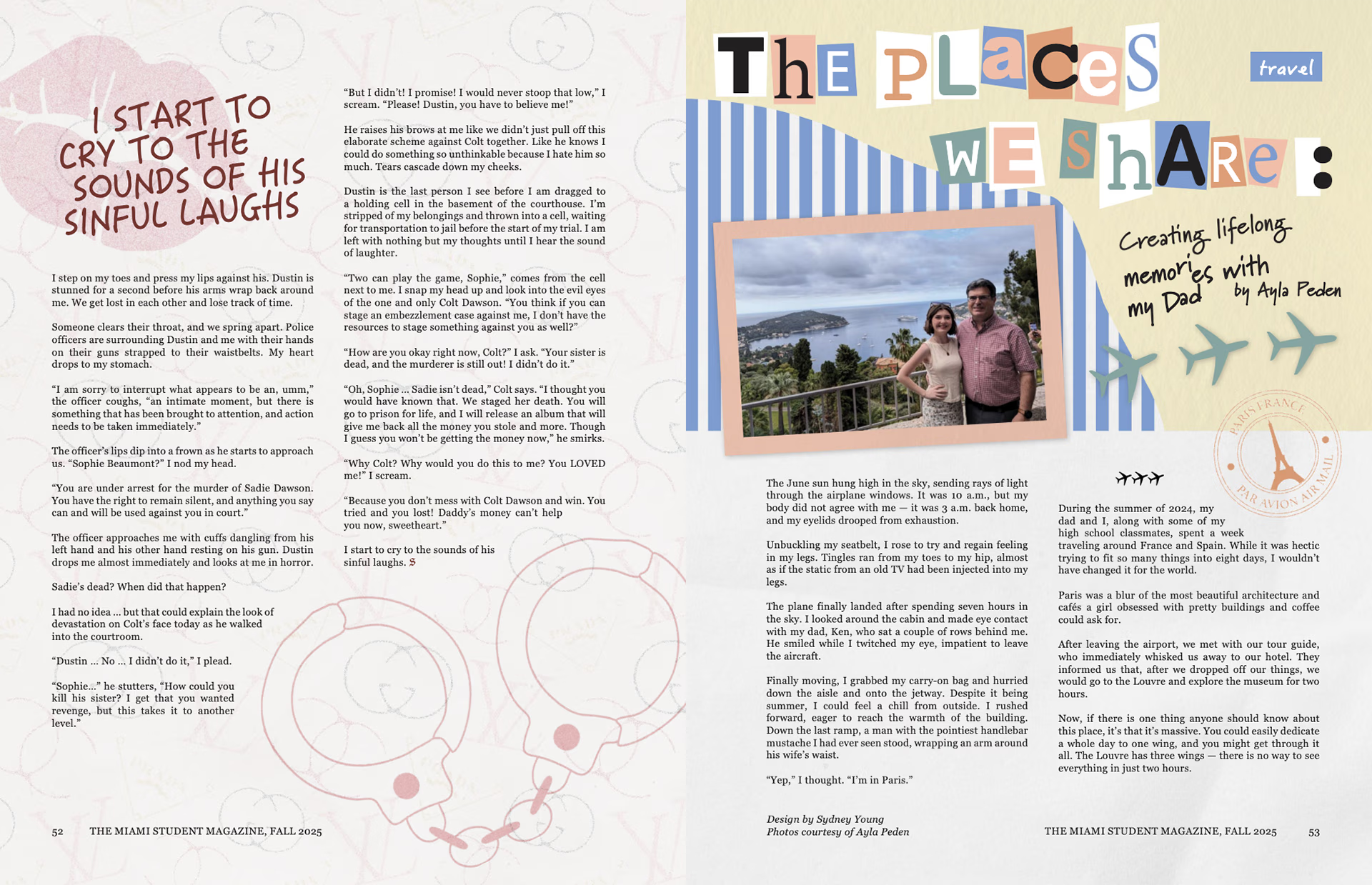
With helpful feedback and reflection, I began to create my second draft. For this draft, I chose to focus on just graphics. I think this made the most sense for the design and story because it is a fictional piece. I also limited the color palette to dark red, pinks, and some gold. The title also went through various changes throughout the drafting process, so I had to create new graphics for each one. For the second draft, I also decided to use a different background image that better resembled the story and main character. The background graphics are made from the logos of designer brands. I chose to include this graphic because the main character, Sophie, is known as a spoiled girl from the Upper East Side of New York City. Some of the inspiration the writer of the story gave me was to think of the character Blair Waldorf from the TV series Gossip Girl. I altered the logos by changing their colors and line weight to pair well with the overall design. I also added a lipstick graphic to indicate breaks within the story. This graphic also fits into Sophie’s personality. The cowboy boots and music notes are meant to resemble the country music aspect of the story and another character, the ex-boyfriend, Colt.
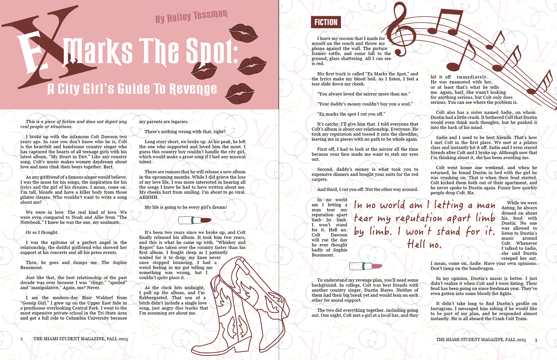
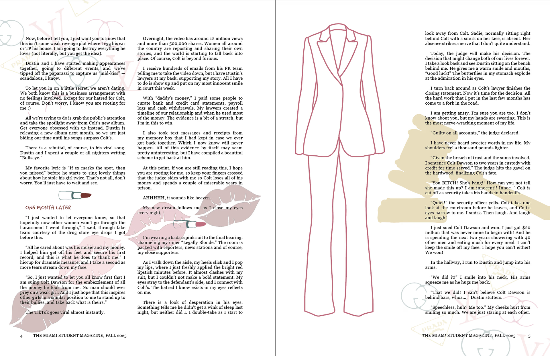
final product
After submitting my second draft, I received feedback and had to turn in a final draft within two days. There were not many changes that needed to be made. I added the same background throughout the entire story, made a few small changes to the title graphic, and moved around the pull quotes as well as some graphics on the last pages. I also added a subtle texture to some of the graphics in Photoshop as a final touch. These final edits enhanced the design and brought the story to life.
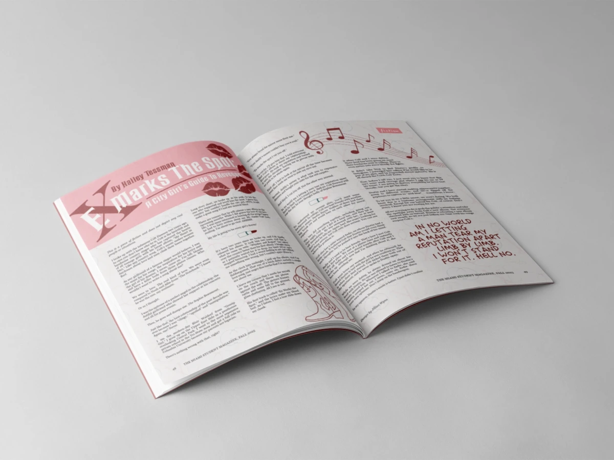
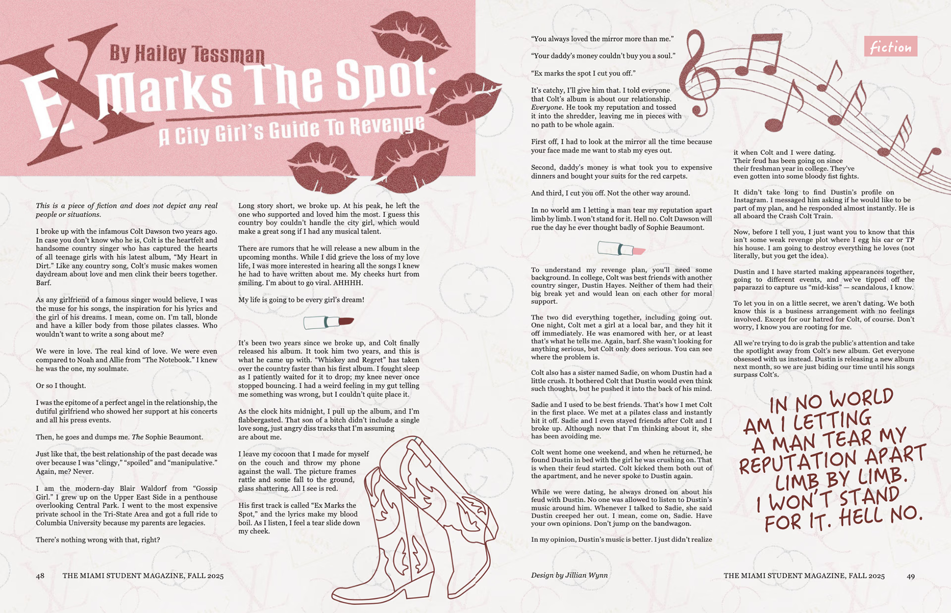
reflections and learnings
Being a part of this student magazine and a part of this project was an amazing experience. I was able to learn new skills while practicing old ones. I continued to learn how to work under strict deadlines and improve my time management skills, all while balancing a full academic schedule. With this project, I was also able to work in a team of not just designers but also writers and editors. I learned how to communicate with the person I was designing for, and to make sure that what they envisioned was seen in the final result.
If you would like to flip through the full magazine virtually, see the link below.