 jilli design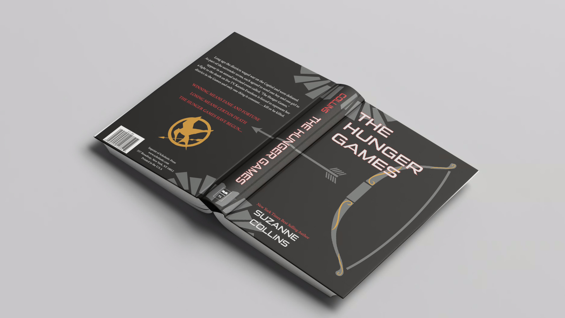
Book Cover Re-design
project introduction
For this project, I was tasked with redesigning a book or album cover of my choice. One major requirement for the design was that we were only allowed to use Adobe Illustrator to make it. I decided to choose one of my favorite book series, The Hunger Games. I read the series in middle school and saw the movies, and was in awe. So to commemorate my love for the dystopian genre and the book series, I began sketching ideas for the cover.
ideation and process work
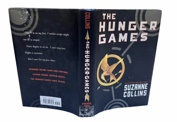
For my redesign, I stuck with a style similar to the original while putting my own twist on it. I kept the same color palette because it fits so nicely with the story and its dystopian themes. I knew I wanted to include iconic symbols and graphics from the story, and I wanted the cover to be cohesive and tell its own story. I created the bow and arrow graphics as well as the Mockingjay pin, both inspired by imagery within the book. I chose to keep the mockingjay from the original cover because it is such an important part of the story (Katniss becoming the Mockingjay herself). The bow and arrow represent Katniss, the main character, who uses them as her weapon of choice. The shapes at the top and bottom of the cover are meant to portray the futuristic and dystopian settings in which the book takes place.
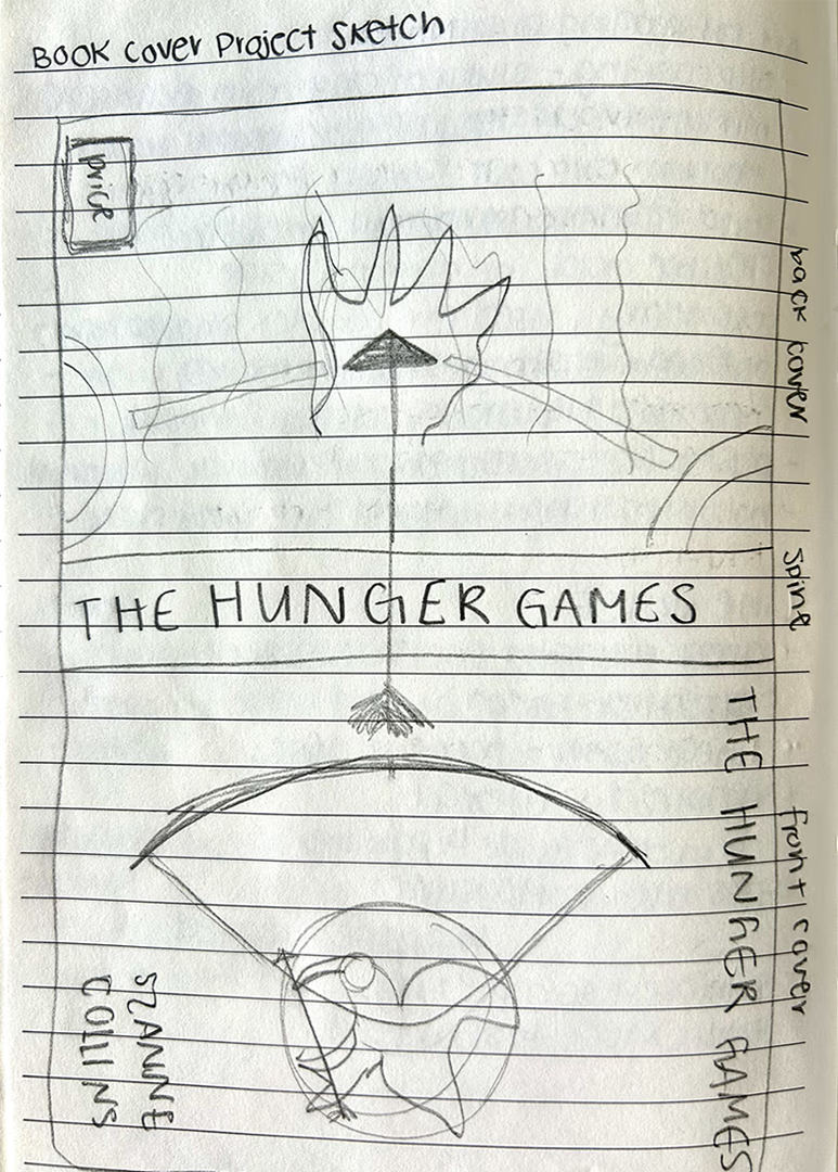
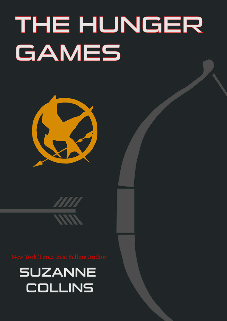
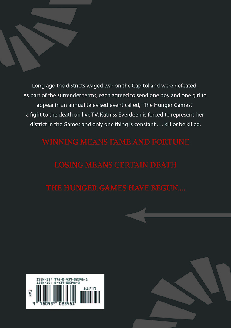
After my first draft, I went through a round of critiques with classmates and also received feedback from my instructor. This feedback led me to make strong and solid revisions that elevated my design and design skills at once. Some feedback I received was that I should make the background black to make other elements stick out better. Another comment was to use a bolder red for the text and to also incorporate the block imagery from the back onto the front, as well as to make the design more cohesive.
final product
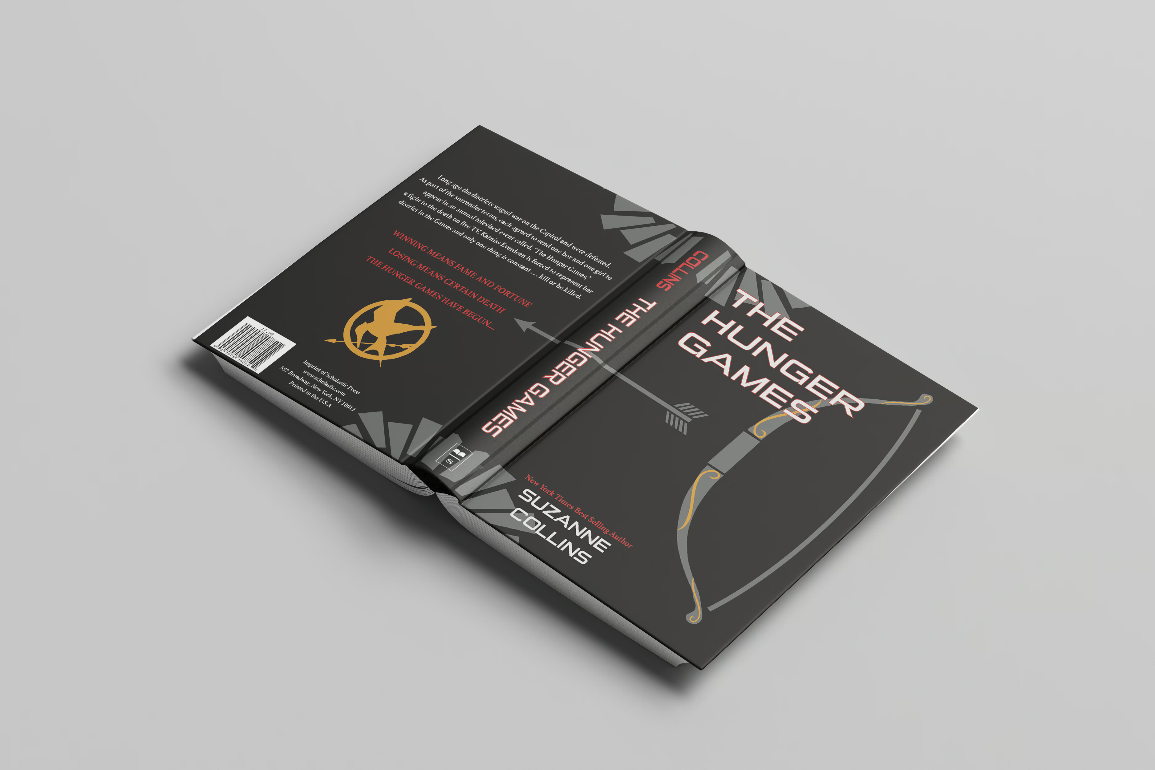
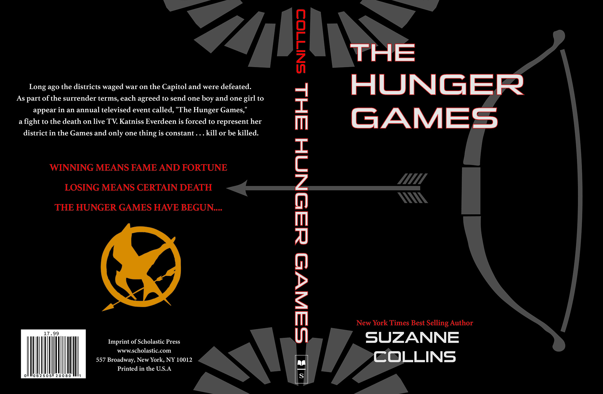
In the two images below, I took this feedback and used it to create a bold and overall cohesive design. I incorporated the elements from the back into the front and even made that join onto the spine. I used a bolder red to contrast against the dark black as well. Finally, in the last version of the design, I incorporated some of the gold from the front onto the back to bring everything together and create a cohesive design.